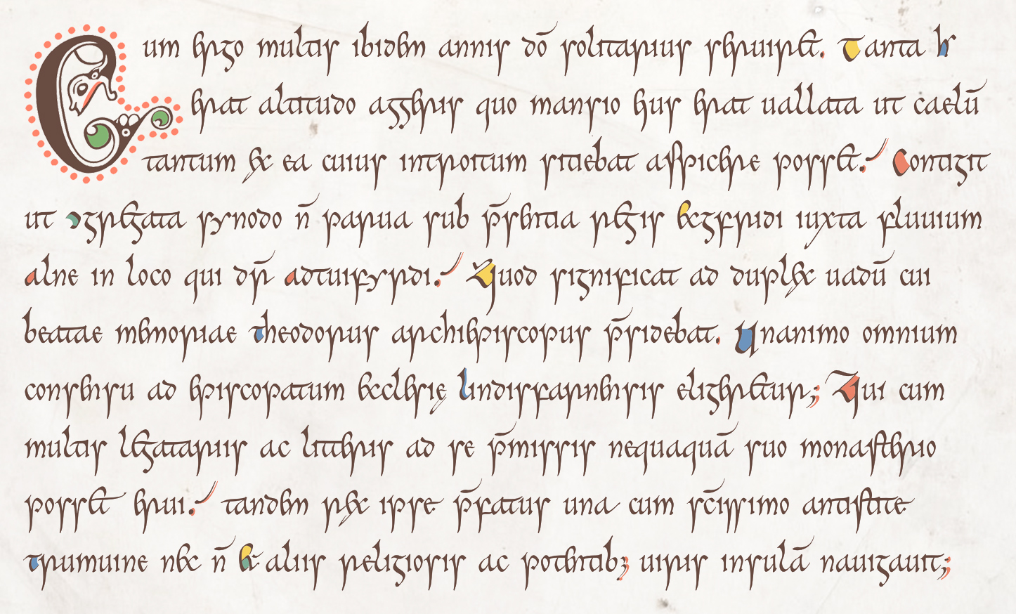
The Cerne font owes the greatest part of its distinctive look to its letterforms—but there’s much more to it than that. The scribe of the Book of Cerne wrote a cursive script, though one that leaned towards the formal: many of its letters are joined, as you can see by glancing at this brief extract from Book IV of Bede’s Ecclesiastical History (in the font’s historical mode):
But you can’t make a cursive script by simply making letters bump against each other; the result of that would be a mess. For two letters to join, the shape of one or both must be adjusted. Consider, for example, the word litteris from line eight of our Bede extract. In the illustration below, the version of the word on the left uses only the Cerne font’s default letterforms, while the version on the right lets the font’s cursive flag fly:
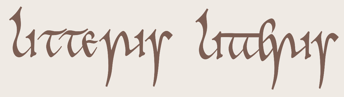
Of the eight letters of litteris, four (two on each end: li and is) match the default forms while the other four do not: these make a ligature (tter) in the middle of the word. In fact, the leftmost t joins with the unaltered i to make it a five-letter ligature.
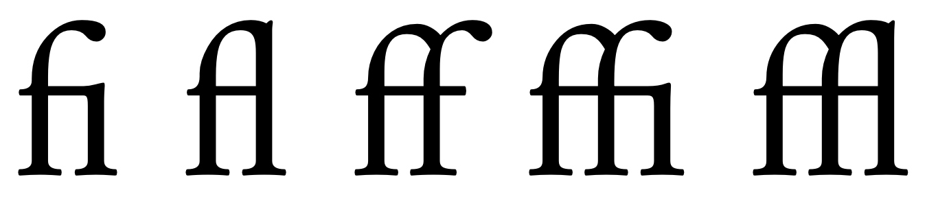
By ‘ligature’ we mean a sequence of letters that are (1) joined, and (2) altered in shape so as to make the join between letters look right. Most fonts for western languages handle ligatures by grouping connected letters into a single ‘glyph’—a unit of type that corresponds roughly to individual pieces of metal type in pre-digital printing. Early typefounders used to group several letters on a single piece of type when the letters touched or overlapped, as is the case with the standard f-ligatures in the JuniusX font:
For JuniusX (and many other fonts, both metal and digital, since the time of Gutenberg), the designer anticipated all the ligatures that the font needed and designed each one as a unit. This doesn't work for Cerne, and a moment’s thought will explain why. Scribes writing out texts by hand have no need to confine themselves to a fixed number of predefined ligatures; rather, they apply rules for joining letters that allow for a nearly infinite number of ligatures of arbitrary length. It is impossible for a font designer to anticipate all the ligatures that might be needed for a font like Cerne, and if it were possible, doing so would make the font impossibly large.
How, then, does Cerne form its ligatures? The technology that accomplishes this task is related to that used to handle scripts far more complex than the Latin script used for most western languages. Of these the best known is Arabic, which among other complications requires that many letters vary their form in order to join or harmonize with surrounding letters. Fonts for these scripts work in part by substituting variant letterforms for the defaults. These variants are called Contextual Alternates.
To form the word litteris, a program called a ‘shaping engine’, a piece of the machinery for displaying text on your screen, begins with the word litteris as it appears on the left in the illustration above, and applies to it rules that are written into the font, substituting characters one by one or in pairs, until it produces the final shape:
The process looks involved, but the shaping engine handles it speedily and invisibly, so that the reader is (ideally) completely unaware of it. And from the font maker’s point of view, designing a few variant shapes of t, e, and r and writing the rules that make all this magic happen is far less work than designing perhaps dozens of ligatures involving those letters—and thousands more to take account of the other letters of the alphabet.
The result is a compact font that can be quickly downloaded with a web page and yet contains within it the thousands of ligatures needed to approximate the look of a hand-written medieval script.
In any script produced by hand, letterforms are highly variable. This variability contributes greatly to the beauty of handwriting. Some variability is a natural byproduct of the fact that a scribe is not a machine, while some is the result of scribal habit or whim.
A computer, of course, is a machine, and it is incapable of whimsy, so reproducing the variability of handwriting is difficult, to say the least. But a computer can give the impression of variability. It can employ pseudo-random algorithms, for example, to vary letterforms (my Joscelyn font uses this approach for the various shapes of the letter h). The Cerne font may at some point employ a system like this, but for now it takes two approaches.
The first approach is to give users the ability to choose variant letterforms themselves. The second is to vary letterforms automatically. For example, consider these two versions of the word passuum (in historical mode):
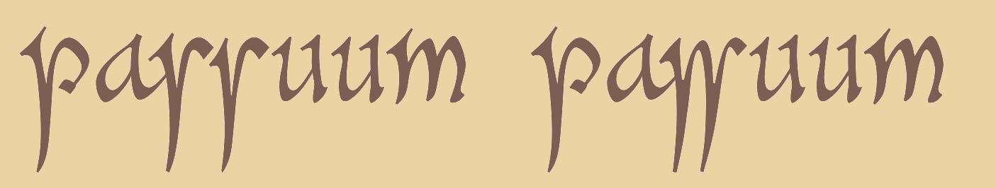
The most obvious difference between the two words is that the one on the right uses a ligature for the doubled insular s while the one on the left does not. Both are consistent with the usage of the Cerne scribe, whose rule for producing this ligature seems to have been (admittedly oversimplifying a bit) “whenever I feel like it.” The Cerne font does not attempt to reproduce the scribe’s whimsy, but instead includes the ligature in the dlig (Discretionary Ligatures) feature. Users can turn this feature on for words with doubled s when they want to—when whimsy strikes. Another way to produce variant letterforms is with the features ss04 (Stylistic Set 4, “Word-final forms”), which has no effect except at the ends of words, and ss05 (Stylistic Set 5, “Miscellaneous alternates”). The number of alternates available via these methods is small but growing (as of version 0.010).
But if you look more carefully at the word on the left, you may notice that the two instances of s and the two instances of u are different from each other. The differences are subtle, since this scribe’s work is remarkably uniform, and extreme variations can be distracting. Most readers won’t notice the differences, but this feature still supports a general impression of handwritten variability.
Doubled letters vary automatically in Cerne via the calt (Contextual Alternates) feature, which is on by default in every major application except for Microsoft Word, where it must be turned on explicitly.
You know, of course, that a conventional font can be rendered in any color: color text is all over the web, and it’s frequently used for titles and running heads in printed books. A color font is different from a conventional font in that the colors in which text is rendered are chosen by the font designer, not by the font’s user. Further, while a glyph in a conventional font must be either one color or another, a glyph in a color font can have any number of colors and combine them in any number of ways. The Cerne font has five colors:

These are based on colors found in the Book of Cerne, but to compensate for some fading over the centuries, and the darkening of the parchment, the last four of them, used for decoration, have been adjusted with reference to the likely pigments used at the time: red lead, orpiment, verdigris, and woad (see Michelle P. Brown, The Book of Cerne (London and Toronto, 1996), pp. 70–73). The saturation of these colors has been reduced, and sometimes the brightness increased, so as to increase contrast with the text color.
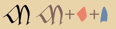
Inside the font, each character consists of at least two layers, and often more—a layer being like a character (or glyph), but meant to be combined with other layers. Each layer is rendered in one of the font’s five colors. For an illustration, let’s look at the letter M, which has two fill colors (the background, by the way, is copied from images of the book itself, but lightened by about 50%):

The font contains four layers for this glyph. The first is a fallback layer. It’s there to guarantee that the font will be usable by applications that know nothing about color fonts. This layer has no color, and it is ignored by applications that recognize color fonts.
The second layer contains whatever is in the text color—a dark reddish brown.
The third layer contains whatever is in red.
The fourth layer contains whatever is in blue.
The application that displays color text renders the three color layers one by one, aligning them exactly. If you’re thinking that this is an inefficient way of going about things, you may be right—but modern font technology is highly optimized with respect to both speed and file size: the web version of Cerne is tiny, and if modern displays render a color font more slowly than a conventional one, the difference is not noticeable.
Beyond this, the details are arcane. There are several competing formats for color fonts. The two most widely used are the COLR format, developed by Microsoft, and the SVG format, supported by Adobe applications, among others. The desktop version of Cerne packages both of these formats in a single file. The web version uses only the COLR format, since all major browsers recognize that. The web version including only a single format has the advantage of keeping the file small: with a moderately fast internet connection it can be downloaded almost instantly.